
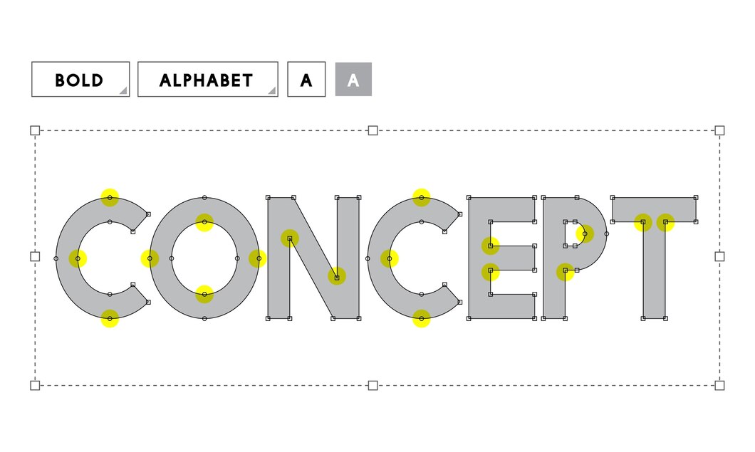
In the early hours of a bustling creative district, where digital screens flickered like city lights and brand messages competed for attention like traffic at rush hour, a young designer sat staring at a blank canvas. Not a literal canvas, but a screen filled with endless type options—fonts, weights, spacing systems, and hierarchies waiting to be orchestrated into meaning. Yet nothing felt right. Every choice felt cosmetic, surface-level, disconnected from purpose.
It was in this moment of creative friction that a senior strategist walked in and said something deceptively simple: “You’re not designing letters. You’re designing perception.”
That sentence became the foundation of a deeper understanding of typography—not as decoration, but as infrastructure for communication.
Typography is often underestimated in the branding ecosystem. Many businesses treat it as an aesthetic afterthought, a stylistic choice made at the final stage of design. But in reality, typography is one of the most strategic tools in brand architecture. It determines how messages are perceived, how authority is established, and how trust is formed in the mind of an audience before they even process the meaning of the words.
In The Highway to Developing Powerful Brands, typography is positioned as one of the core pillars of brand intelligence. The book argues that brands do not simply communicate through visuals—they communicate through structured typographic systems that influence emotion, clarity, and decision-making. In other words, typography is not passive formatting. It is active persuasion.
To understand its importance, we must step into the psychology of reading. The human brain does not read letter by letter in modern digital environments. It scans shapes, patterns, and rhythm. Typography controls this rhythm. It dictates speed, tone, and emotional temperature. A bold sans-serif typeface signals confidence and modernity. A serif typeface suggests tradition, authority, and intellectual depth. A poorly spaced paragraph, however, creates friction—a cognitive tax that weakens trust and reduces engagement.
In branding, trust is currency. And typography is one of its most powerful regulators.
As the young designer continued experimenting, the strategist introduced a concept from the book: typographic hierarchy as a decision-making framework. Headlines are not just larger text—they are entry points into thought. Subheadings are navigation systems. Body text is the operational layer where comprehension either stabilizes or collapses. When hierarchy is weak, communication becomes noise. When it is strong, it becomes guidance.
This is where many organizations fail. They invest heavily in logos and color systems but neglect the typographic architecture that carries their message across every touchpoint. Websites become visually attractive but cognitively exhausting. Marketing materials look polished but fail to convert. Internal documents appear inconsistent, weakening brand cohesion from the inside out.
Typography resolves this fragmentation by creating consistency of voice across all communication layers.
In modern brand systems, typography operates like an operating system. It defines rules, not just styles. It governs spacing ratios, line heights, alignment logic, and responsive scaling. When implemented correctly, it ensures that whether a customer is reading a mobile app interface, a billboard, or a corporate report, the brand feels like one unified entity.
The Highway to Developing Powerful Brands describes this as “silent branding”—the idea that the most powerful brand signals are not always visible logos or slogans, but the subconscious familiarity created through consistent typographic behavior.
As the narrative of the designer unfolds, the breakthrough moment arrives when typography is no longer seen as selection, but as system design. Instead of choosing fonts based on preference, the designer begins building a typographic ecosystem: primary typefaces for authority, secondary typefaces for flexibility, and supporting styles for emotional nuance. Each choice is no longer aesthetic—it is functional.
At this stage, typography becomes strategic infrastructure.
Consider the role of typography in digital transformation. As organizations shift into multi-platform ecosystems—web applications, mobile interfaces, automated communication flows—typography becomes the only consistent carrier of identity across fragmented environments. Unlike imagery, which must be adapted or recreated, typographic systems scale effortlessly. They ensure that brand tone remains intact even when content is dynamically generated or algorithmically distributed.
This scalability is what makes typography a high-leverage asset in modern branding.
But beyond structure and consistency, typography also carries emotional intelligence. The spacing between letters, known as kerning, can influence perceived openness or density. Line spacing, or leading, affects readability and calmness. Even text alignment communicates subconscious cues—centered text feels formal and ceremonial, while left-aligned text feels grounded and practical.
These subtle decisions accumulate into perception.
In The Highway to Developing Powerful Brands, there is a chapter that reframes typography as “emotional engineering.” It explains that every typographic decision contributes to the emotional trajectory of the audience. A financial institution, for example, cannot afford typographic instability. It must communicate precision, trust, and control. A creative agency, on the other hand, may leverage experimental typography to signal innovation and disruption.
Typography is therefore not universal—it is contextual intelligence.
As the designer refined the system, something transformative happened. The blank canvas was no longer empty. It became structured with invisible rules guiding every future decision. The anxiety of choice disappeared, replaced by clarity of system logic. This is the hidden power of typography—it reduces cognitive chaos for both creators and audiences.
In business environments, this reduction of chaos translates into measurable performance outcomes: higher engagement rates, improved readability, stronger conversion funnels, and increased brand recall. When users do not struggle to read, they are more likely to act. When messages are effortless to consume, they are more likely to be trusted.
Typography, in this sense, is not design ornamentation—it is business infrastructure.
Yet despite its importance, many organizations still operate without formal typographic systems. They rely on default fonts, inconsistent spacing, and ad-hoc design decisions. This creates fragmentation across departments and channels. Marketing speaks one visual language, operations another, and product interfaces another entirely. The result is not just visual inconsistency—it is strategic dilution.
The book emphasizes that powerful brands do not scale visuals; they scale systems. Typography is one of the most scalable systems available because it is lightweight, flexible, and universally applicable.
Returning to the designer’s journey, the final realization emerges: typography is not about making things look good. It is about making meaning flow efficiently through every interaction point. It is the silent structure beneath persuasion, the invisible framework behind clarity, and the disciplined system behind emotional resonance.
When the project is finally presented, the difference is immediate. Stakeholders do not comment on fonts. They comment on clarity. On professionalism. On coherence. On confidence. They cannot always articulate why it feels right—but they recognize that it does.
That is the power of typography done correctly.
In conclusion, typography is one of the most underestimated yet strategically critical components of branding. It shapes perception before content is even consciously processed. It builds trust without speaking. It structures meaning without noise. And as highlighted in The Highway to Developing Powerful Brands, it is not merely a design choice—it is a foundational business system.
Organizations that master typography are not just designing better visuals. They are engineering better communication ecosystems. They are building brands that think, speak, and behave consistently across every platform and every interaction.
In a world overloaded with information, typography is no longer optional. It is a competitive advantage.
And those who understand it do not just design brands—they design clarity itself.
Ready to upgrade your brand?
Creat Branding Ltd can help you build brand identity, company profiles, websites, signage, and marketing assets.
Request Consultation